Are you sending out direct mail campaigns and getting a lack-luster response? There are many factors that can contribute to an underwhelming direct mail campaign but perhaps the most obvious is the way it looks!
The average person gets 2-3 pieces of mail per day. While that pales in comparison to email, (most professionals get more than 100 per day) it’s still competition. So how do you ensure that your mail piece is victorious and gets the attention it deserves?
For starters, don’t do what everyone else is doing. A standard postcard or #10 envelope isn’t going to cut it. But a unique shape—created with a die cut—is a sure-fire way to rise above other mailbox competitors. In fact, some reports say that die-cut direct mail can boost response rates by 300%.
Sounds great, right? But before you start brainstorming, let’s cover some die-cutting basics and what you’ll need to create your next die-cut direct mail piece.
What is a Die Cut?
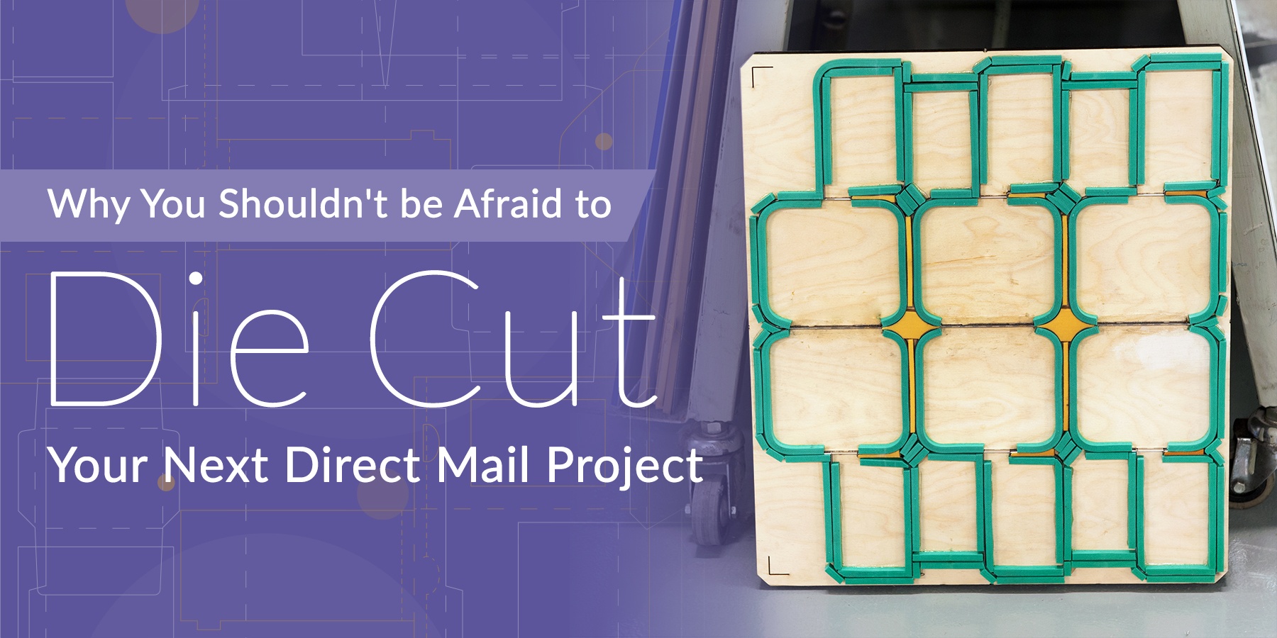
A die cut is made from a dieline in an artwork file and it defines the shape and structure of a final printed piece. Once flat sheets come off a printing press they are sent to a die-cutting machine where they will be cut into any custom shape. The machine uses a pre-made die (created from a dieline) which has steel blades that cut and score the press sheets.
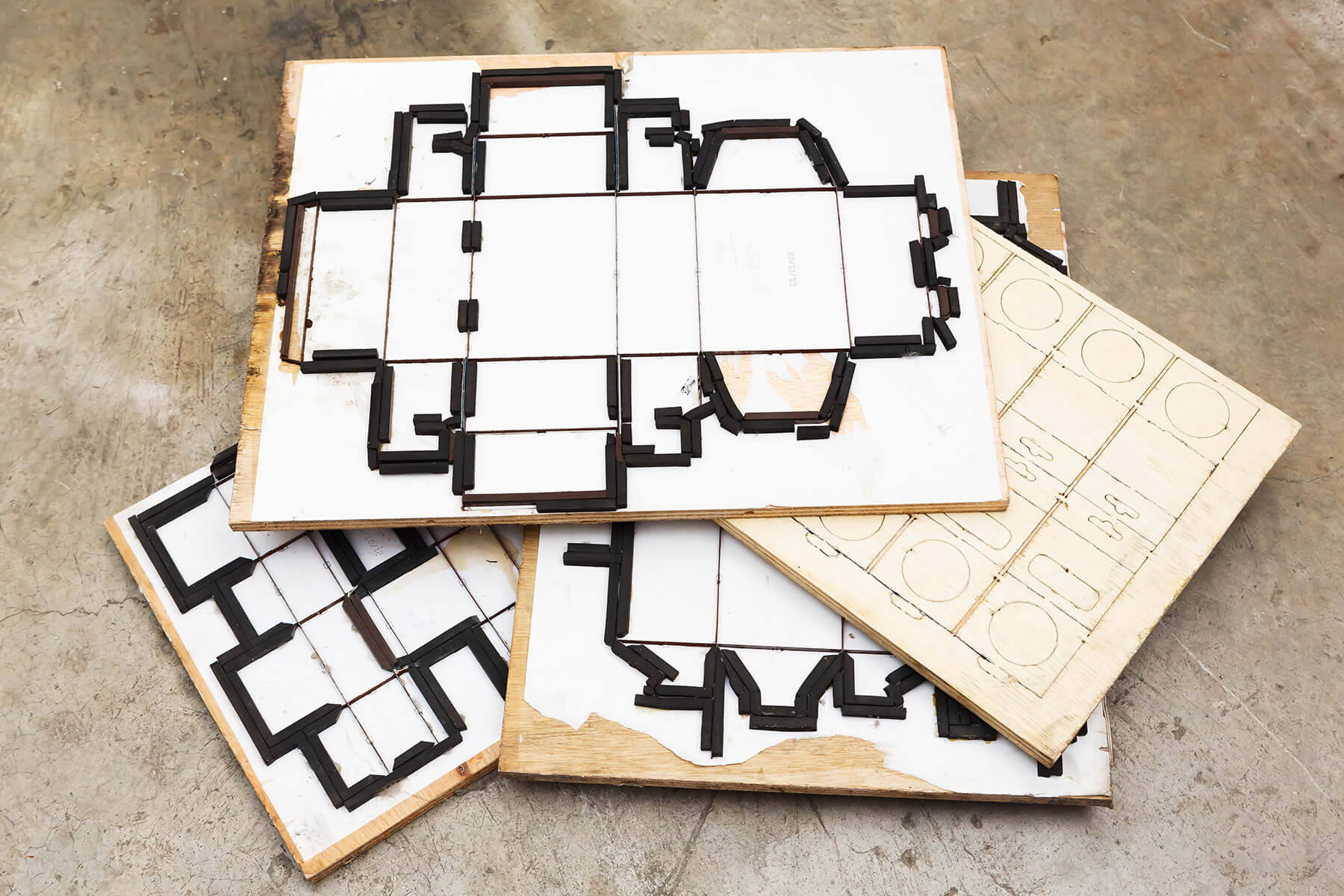
It may sound a little complicated, but a dieline is really just a blueprint or template for your printer to follow. If you look in your kitchen cabinet you’ll find a ton of examples of dielines. For example, if you flatten out a cereal box, you’ll be looking at a dieline. The edges are the cuts and the creases are the folds. Dielines can be created from scratch, but you’ll save time during the design process if you start from an existing dieline and modify it to suit your needs.
Now that we’ve outlined some dieline basics, let's take a look at how a die-cut direct mail campaign can benefit your brand.
Die-Cut Shapes Add Brand Recognition
Unlike digital campaigns which are one-dimensional, direct mail comes in any shape and size! Using a unique die-cut shape, you can visually convey your brand or campaign theme before anyone reads a word of copy. For example, a car rental company could use a self-mailer in the shape of a car or a travel company could die-cut a cruise ship into the pages of their catalog mailer.
The Frankfurt Institute of Advanced Studies conducted research on cognitive processing and found that it only takes 150ms to process an image, which is about the time it takes to blink. On the other hand, it can take people twice as long to process written words. So if we can process an image in the blink of an eye, it is logical to assume that adding dimensionality and shape to an image can lead to faster processing and recognition.
Start by brainstorming shapes that may symbolize your brand and message, but make sure to keep the value of your offer and audience persona in mind. Your die-cut direct mail campaign should strike the right balance between creativity, functionality, and tone. For example, B2B brands may find that a subtle approach using a simple shape or layered die-cut will do the trick without going overboard.
People Hang Onto Interesting Direct Mail
Whether at home or at the office, if a company sends you something interesting, chances are you’ll hold onto it longer. In fact, 48% of people retain direct mail for future reference. This is particularly true for companies that sell to marketing and creative professionals. We’ve got a whole box of interesting direct mail pieces in our office and it can come in super handy when we’re in a brainstorming session.
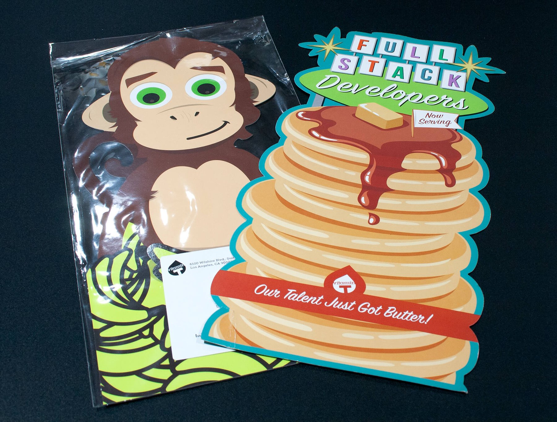
This is exactly why creative staffing agencies use interesting die-cut mailers as a part of their marketing strategy. Check out these die-cut examples from Vitamin T which I’ve hung onto for several years. These eye-catching pieces mailed in a clear envelope (more on that below).
Die-cut Gifts are the Perfect Brand Reminder
When someone likes your mail enough to hang onto it, that’s a win. So why not just make that part of the strategy in the first place? Include a die-cut piece that’s designed for your recipient to keep.
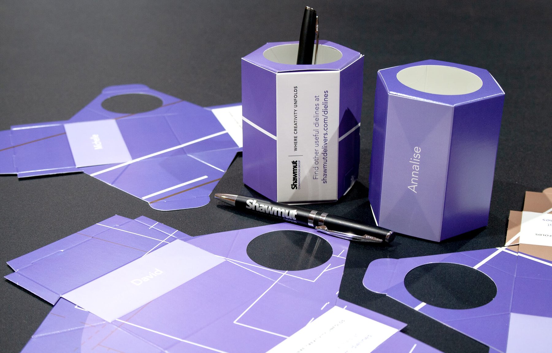
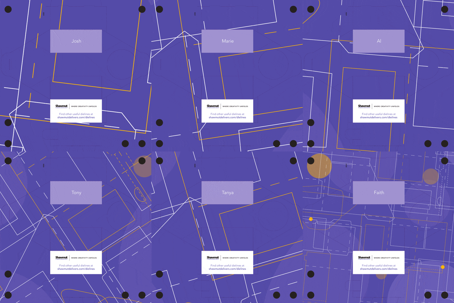
We recently used this strategy in the May/June issue of Tactics Magazine. Inside the magazine, we included a personalized pencil cup. It was sent flat so that recipients could see how the dieline worked. When they put it together, they had a unique pencil cup and a reminder of our brand. We used dynamic personalization to create unique artwork for every person on our list!
Interactive Die-Cut Mail Connects to Social Media
In addition to giving recipients a branded memento, you can encourage social sharing and engagement with die-cut direct mail. Here’s a great example from Fold of the Week, a YouTube series from direct mail expert and founder of FoldFactory Trish Witowski.
Using the example above, you could encourage recipients to take a selfie or group photo wearing the glasses or run a contest using a hashtag on Facebook or Instagram. This is a great way to expand your reach well beyond your original direct mail list.
Use the Envelope to your Advantage
One of the easiest ways to send die-cut direct mail pieces is to use an envelope. Without an envelope, you’ll have to comply with a number of USPS regulations that might limit your creativity.
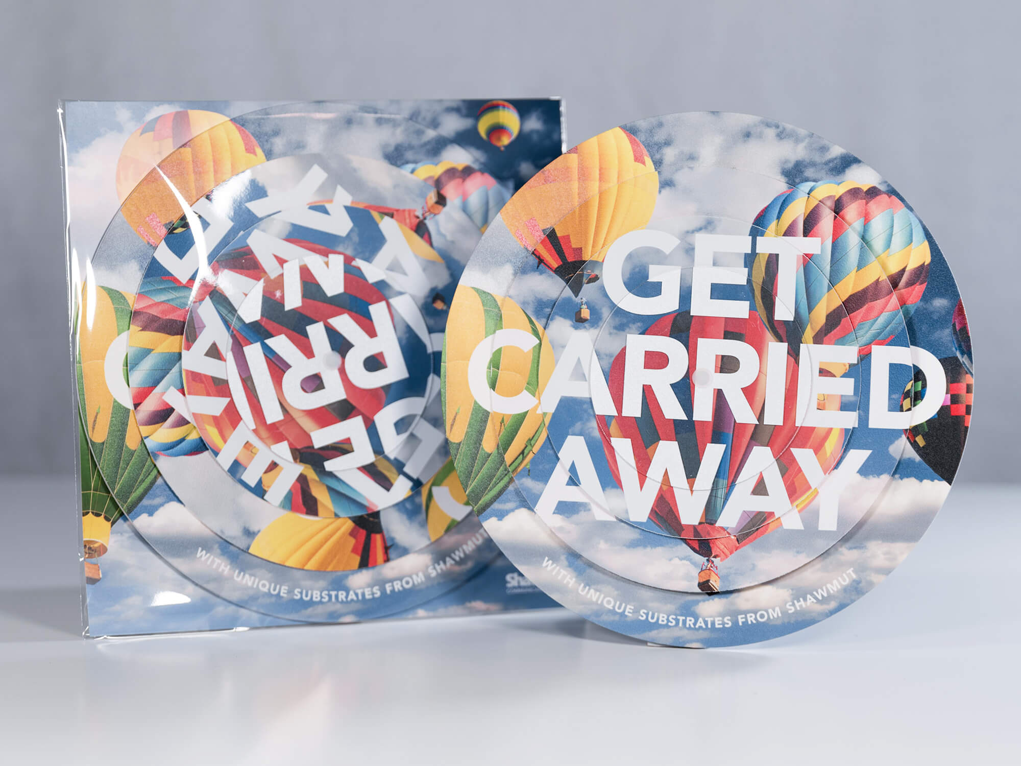
A great way to send your die-cut direct mail campaign and ensure recipients immediately see your creativity is to use a clear acetate envelope. These come in a variety of shapes and sizes and are sealed with a simple peel-away glue strip. You’ll have to pay a small postage surcharge, but if your campaign is well-designed, the ROI will make up for it. Our circular Substrates mailer was sent in a clear envelope.
Last year, USPS also tested and approved several shape cut envelopes. These envelopes have a “trailing edge die-cut” and were found to be automation compatible, meaning that there are no additional postal surcharges! Below are a few of the samples of the previously approved die-cut envelopes.
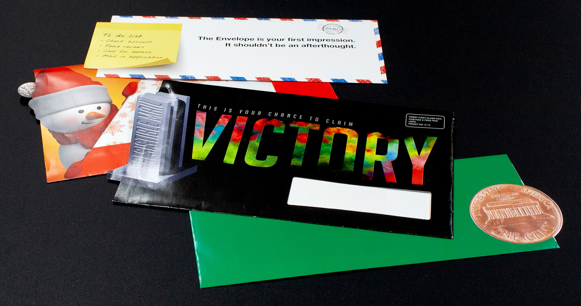
Moving forward, the USPS is considering expanding this ruling to allow almost any shape that extends no more than 5/8″ off the trailing edge with .300″ clearance at the bottom fold and .300″ clearance at the top fold.
Think in Terms of ROI, Not Price
The cost associated with any die-cut direct mail campaign will depend on a number of variables such as the quantity, paper stock, timeline, and complexity of the die file. Although you will incur some additional expense, die cuts can also offer a big bang for the buck in terms of ROI.
The key is to make sure you’re spending your creative resources and print dollars wisely by following the 40/40/20 rule. This rule—developed in the 60’s by the late marketing expert Ed Mayer—states that 40 percent of the success of your campaign depends on your list; 40 percent depends on your offer, and 20 percent depends on the message and creative.
I’m sure many of us would prefer to spend more time thinking about the creative strategy. However, we also know that the biggest mistake you can make in direct mail is sending your campaign to the wrong list. So before you embark on a die-cut direct mail campaign, make sure you’ve done your homework. Carefully comb your list, segment your audience, and provide a relevant, compelling offer that’s personalized to the recipient whenever possible.
Plan Your Die-Cut Direct Mail Campaign Carefully
Last but not least, creating a die-cut direct mail campaign takes careful planning. The details of your die file really matter. If one measurement is slightly off it can negatively affect the entire production process—wasting time and money. That’s why it’s important to work with your printer early on in the process. They can help you select the best materials, provide ready-to-use dielines and templates, and test your direct mail piece prior to production.

