Direct mail has a higher response rate than any digital marketing tactic. Its response rate is five to nine times higher than email, paid search, or social media, according to ANA/DMA Response Rate Report 2018.
To achieve such a high response rate though, you have to create an effective direct mail campaign. So, what makes an effective direct mail campaign? No matter the form, size, shape, or length of a campaign, there’s an anatomy to direct mail messages that’s universal.
Here’s the anatomy of an effective direct mail campaign:
An attention-grabbing headline
Every direct mail piece, whether it’s a letter, postcard, or magazine, has a headline of some sort. The headline is the face of your direct mail campaign because, like a person’s face, the headline is one of the most noticeable and memorable features of a campaign.
Take a look at this postcard that we created for obp, a provider of single-use self-illuminating medical devices. Check out the headline, “ER-SPEC now available in XS and XL sizes.”
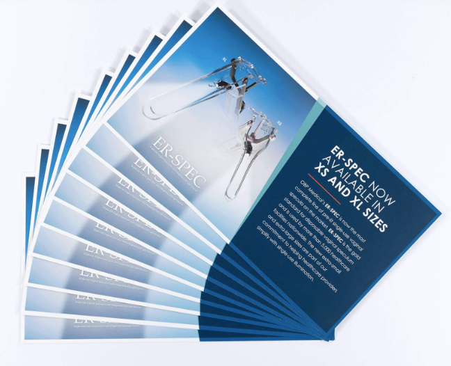
There’s no question, that headline is one of the most noticeable elements of the postcard. The headline itself is short and to the point, and its design, with large font and uppercase letters, makes it stand out.
Hypnotic imagery
Imagery is the heart of a direct mail campaign since it often stirs emotion and makes a connection with readers.
Research shows customers can recall 65% of visual content they see almost three days later. In other words, if a customer sees a direct mail campaign, the images are remembered. It’s all the more reason to find or create images that aren’t merely good, but hypnotic. You want a customer to get lost in an image, even it’s for a second or two.
While most marketers know the power of images, many struggle to find appropriate choices for campaigns. Overused stock photos or poorly-produced product shots won’t cut it. Customers have high expectations.
Many marketers (41%) say original images perform the best. It explains why a growing number of companies are investing in professional product imagery or turning to a graphic designer to create a unique visual for campaigns.
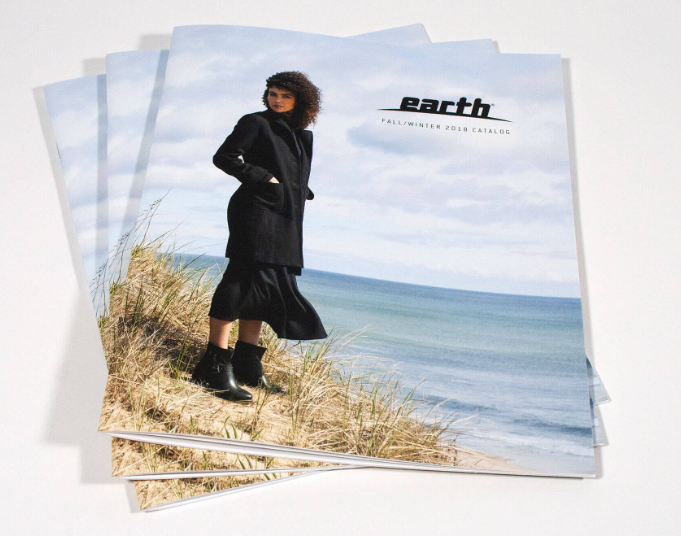
Take a look at the catalog that we printed for Earth Brands. The image of the woman standing on a sand dune, wearing a pair of the company’s latest boots, is amazing. It makes the customer feel like they’re at the beach on a windy day, just taking stroll along the oceanfront.
A customer-centered message
The message is the “meat” of the campaign. It’s the message that customers consume and digest, so to speak, so we’ll call the message the stomach of the campaign.
Messages vary greatly across campaigns. From long, letter-form messages to short, snappy coupons, the message length will vary based on the campaign’s purpose.
However, no matter how long your message is, direct mail messages should have:
One, succinct point
The point of a direct mail message is to explain one point to customers, swiftly. Before you sit down to write the text for any campaign, know its goal and intended audience. That will guide your writing.
Active language
Watch the language you use. Use an active, positive voice.
Personalization
Personalized campaigns get higher response rates. When you can, consider adding a customer’s first name, a job title, a birthday, or another piece of personal information.
With techniques like variable data printing, personalizing a campaign is easy to do.
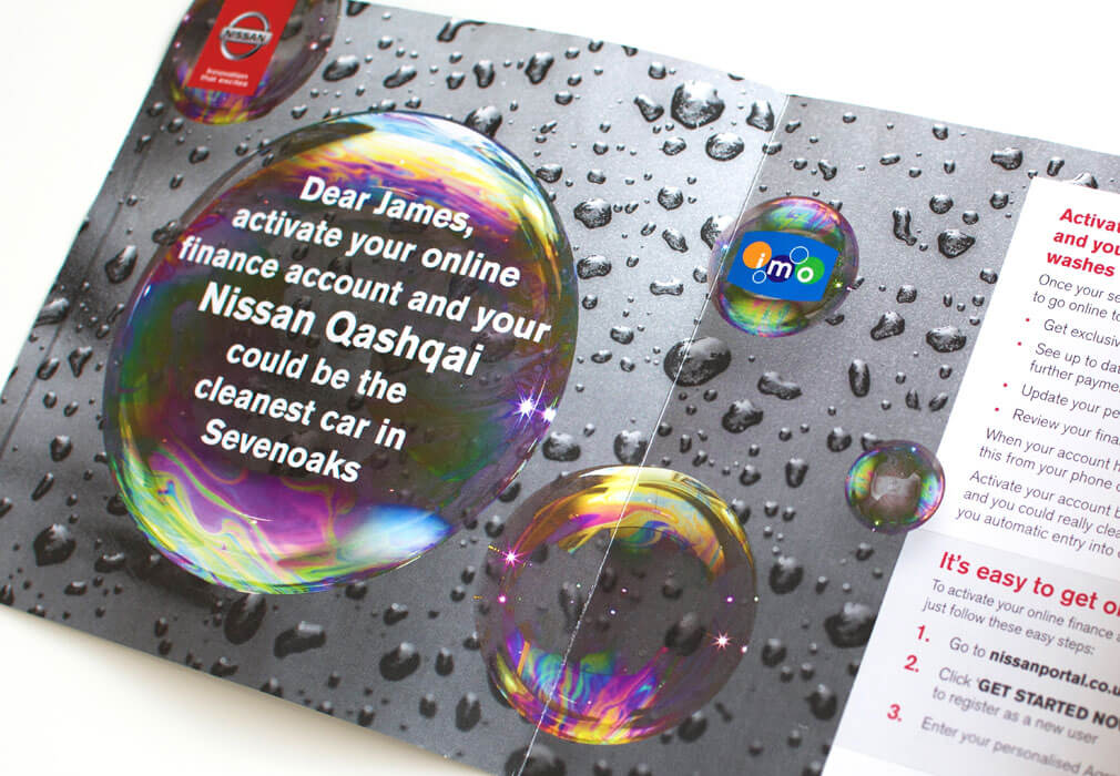
Here’s a great example of a succinct, active, personalized direct mail campaign. Notice the recipient’s first name, their vehicle make and model, and city mentioned prominently.
A smart call to action
The call to action is the brain of a direct mail campaign. It gets customers thinking about what they just read.
Of course, creating an effective call to action for a direct mail campaign takes some work. To create an effective call to action, here’s what to do:
Create a plan
What’s the purpose of the direct mail campaign? Is it to drive traffic to a website? Encourage customers to download a form? Enter an online contest?
Whatever the purpose of the direct mail campaign, the call to action should provide a solution. If the campaign is meant to drive website traffic, for example, the campaign will provide a link for customers to visit.
However, tossing any old link on your direct mail campaign is a bad idea. Ideally, you’ll send traffic to a designated landing page that correlates with your direct mail campaign. It should have the same look and feel, and be easy to navigate.
Before you add a call to action to any campaign, you need to make and execute a plan. In this case, you need to create a landing page before you send the campaign.
Make it short and clear
A call to action should be easy to follow. When customers read it, there should be no confusion on what to do.
Use urgent language
You don’t want customers to act two days from now, you want them to act now. The words you choose for your call to action should have a sense of urgency.
How do you do that? For starters, use action words like “now,” “today,” or “limited-time offer.”
You can also give the customers a deadline to take advantage of an offer.
Use design elements to make it pop
The call to action shouldn’t blend in with the rest of the campaign, it should stand out. Make wise design choices that bring the call to action to the forefront.
For example, the call to action might be in a different color, in a large font, or set inside a box.
Take a look at the mailer below that we helped Johnson and Wales University send out to encourage students to take a campus tour.

Notice the CTA at the bottom. It checks all the boxes. The link takes interested students to a specific landing page that focuses on scheduling a visit. The message is short and clear, simply saying, “Register Today.” And, the design helps it stand out.
A wow factor
To stand out in a crowded mailbox, sometimes you need a wow factor. Consider printing a campaign on glitter paper, use a unique shape, or send something that recipients can make from the mailer itself.
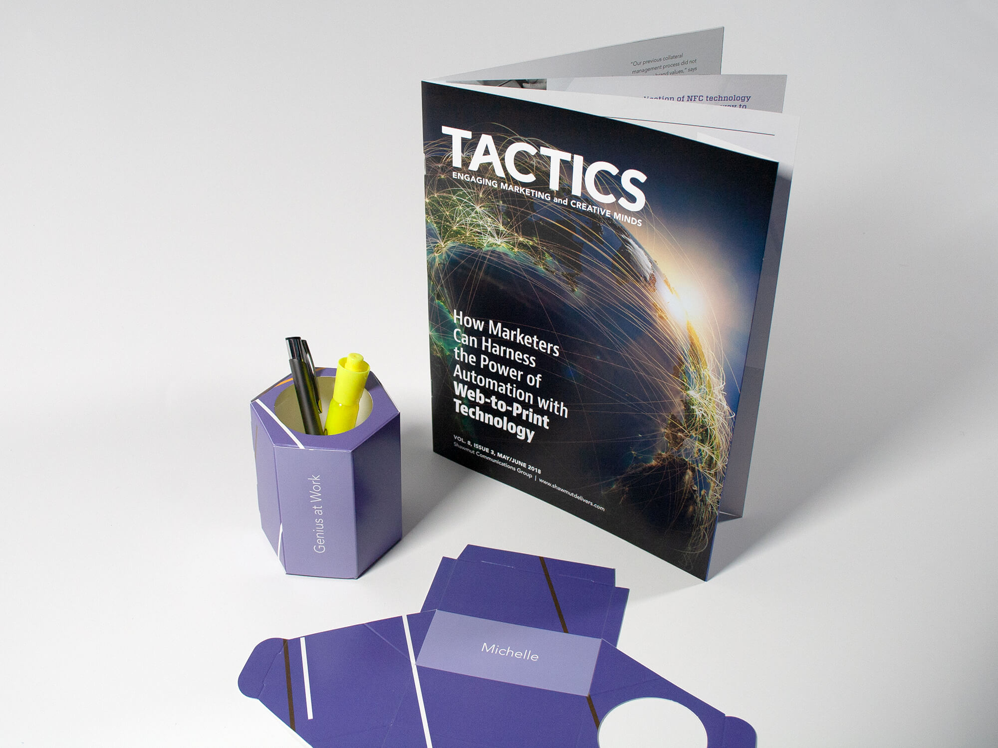
Think of the ‘wow factor’ as the fingerprint of a campaign. Every fingerprint is unique, just like a magazine with a personalized pencil holder that readers could put together themselves.
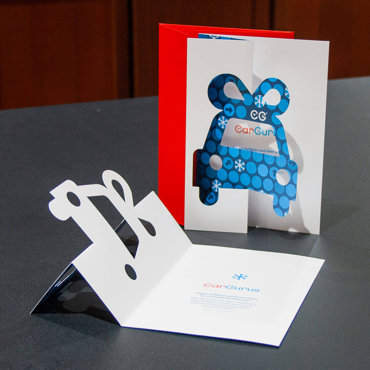
This die-cut holiday greeting card from CarGurus is another great idea. The unique car cutout makes it so much more appealing than a standard holiday greeting card.
Wrap up
Direct mail campaigns can be wildly successful for your brand, but there’s a certain anatomy that every campaign should have. By referencing the anatomy lesson above, marketers can create a campaign that recipients will respond to. As always, Shawmut is happy to help you create, send and track the ROI of your next direct mail campaign.


