These days there is much more to printing than putting ink on paper. There’s a whole world of special effects, textured coatings, unique substrates, and enhancements that make print truly come alive. The good news is that many of these effects are easy to achieve and more cost-effective than you would think, particularly when they are done using a digital press.
Printing on a digital press such as the HP Indigo allows designers to differentiate their print materials without a lot of press setup time or additional printing plates like those required for an offset press. Assuming the project is a good fit for digital printing in terms of size and quantity, digital print effects can be a great way to add bang for the buck.
However, we’ve noticed that some graphic designers aren’t aware of these capabilities or how to build them into their files. That’s why we’ve put together quick 3-step guides for two digital print effects including white ink and transparent ink.
Preparing Files for Printing with White Ink
White ink opens up a new world of possibilities when it comes to printing on dark, metallic, clear or other specialty substrates. It can be used as a standalone effect or as a “backer” to help mitigate changes in color output when printing on a substrate other than white paper. For example, if you were printing an image on a clear frosted acrylic substrate you may want to lay down white ink below the image so that it doesn’t look muddled.
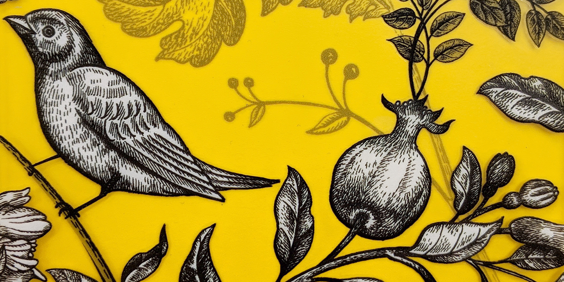
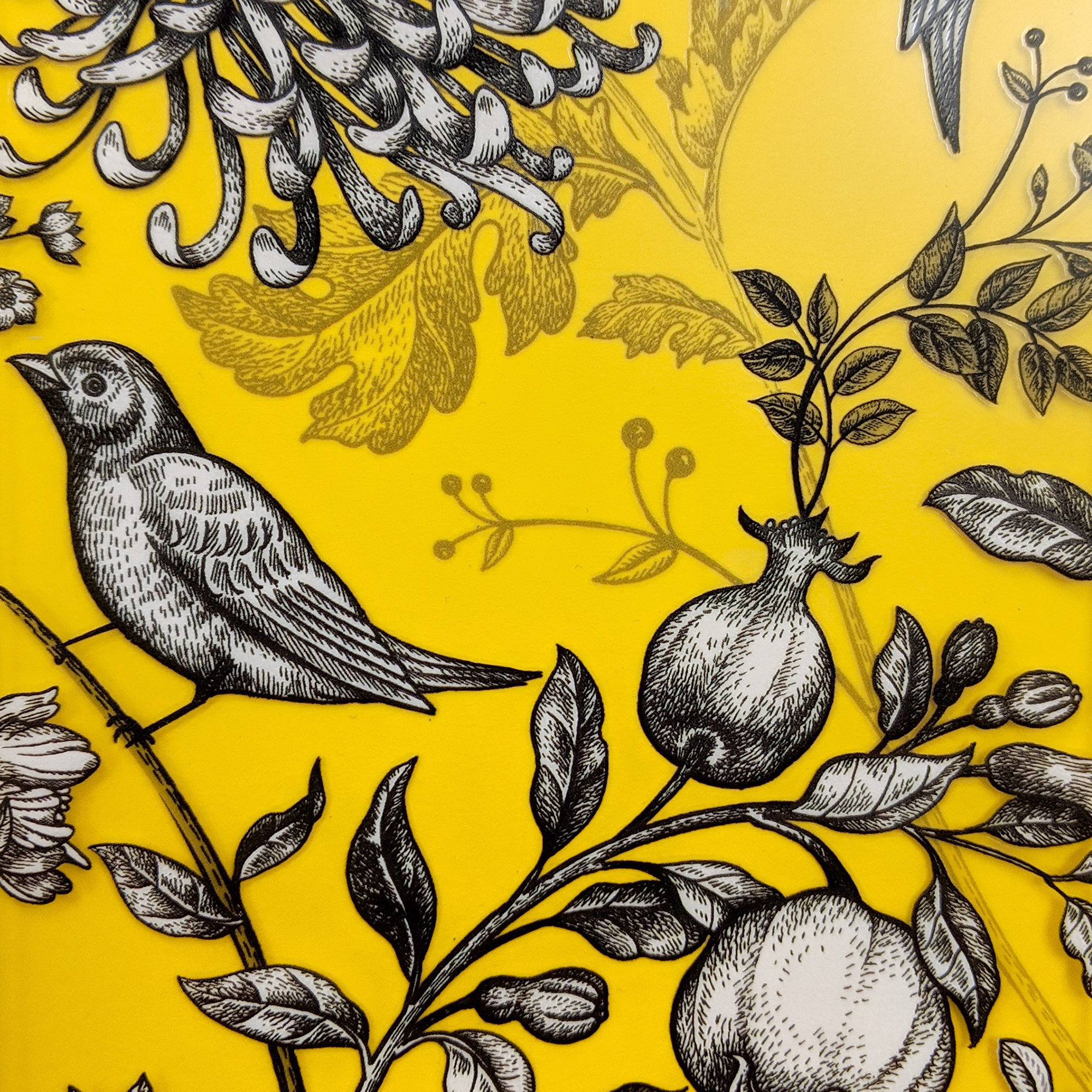 This window cling was printed on a clear substrate with a layer of white ink to add opacity and depth.
A sheet of yellow paper placed below shows the transparency and areas where white ink was applied.
In your design files, white ink is treated as a spot color. Like any spot color, you can experiment with tints of white to create varying levels of opacity and effects.
To produce the example above, we set up our file with three layers. The "White" layer (shown in pink) was sandwiched between two other layers of color. The third tile below shows the content from the white layer alone.


Using Adobe InDesign or Illustrator:
- Create a new layer called “White”. In some instances—such as when printing on dark colored or transparent substrates—4 color process will be applied on top of the white to make the color stand out. If you choose to do this, be sure to tell your printer so those specific white elements can be printed first. Be sure to place your "White" layer properly in your layer stack.
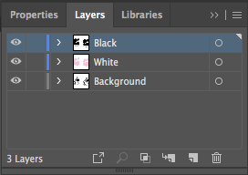
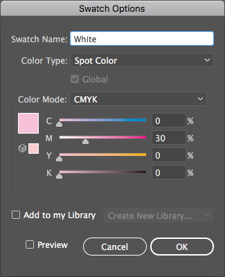
- Create a new spot color swatch called “White” in your swatches panel. It can be helpful to give this swatch a sample color so it’s easier to see on screen. In this example, we used pink.
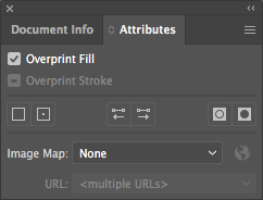
- Use the new “White” color on the “White” layer and set the objects to Overprint in the Attributes panel.
Preparing Files for Printing with Transparent Ink
Transparent ink is another cool feature that can be used when printing digitally. It enables graphic designers to achieve a look similar to watermarking, specialty coatings and ghosted image effects.
Using Adobe InDesign or Illustrator:
- Create a new layer (on top of all other layers) called “Transparent”.
- Create a new spot color swatch called “Transparent”. It’s helpful to set this color to 30% yellow and 30% magenta so it’s easier to see on the screen.
- Use the new “Transparent” color on the “Transparent” layer and set the objects to Overprint in the Attributes panel.
Using white or transparent inks are just two ways to add interest to your next print piece, but there are many more. From unique substrates and coatings to die-cutting and embossing, there is no shortage of print production tools and techniques to make a print piece truly memorable.