Today’s printing is personalized, interactive, tactile, and fun. There is an endless array of creative options and technology available to help brands deliver engaging and memorable print experiences. However, the vast majority of marketers and designers aren’t taking advantage of everything print has to offer. Why? Because they haven’t been exposed to it.
‘I didn’t know you could do that with print!’ We hear this often, particularly when people tour our print production facility. Many marketers and designers—even those that have been in the industry a while—have never visited a printer and it can be a really eye-opening experience. It shows them what’s possible and highlights how much happens behind the scenes to bring their creative vision to life.
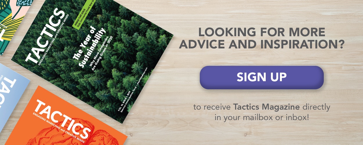
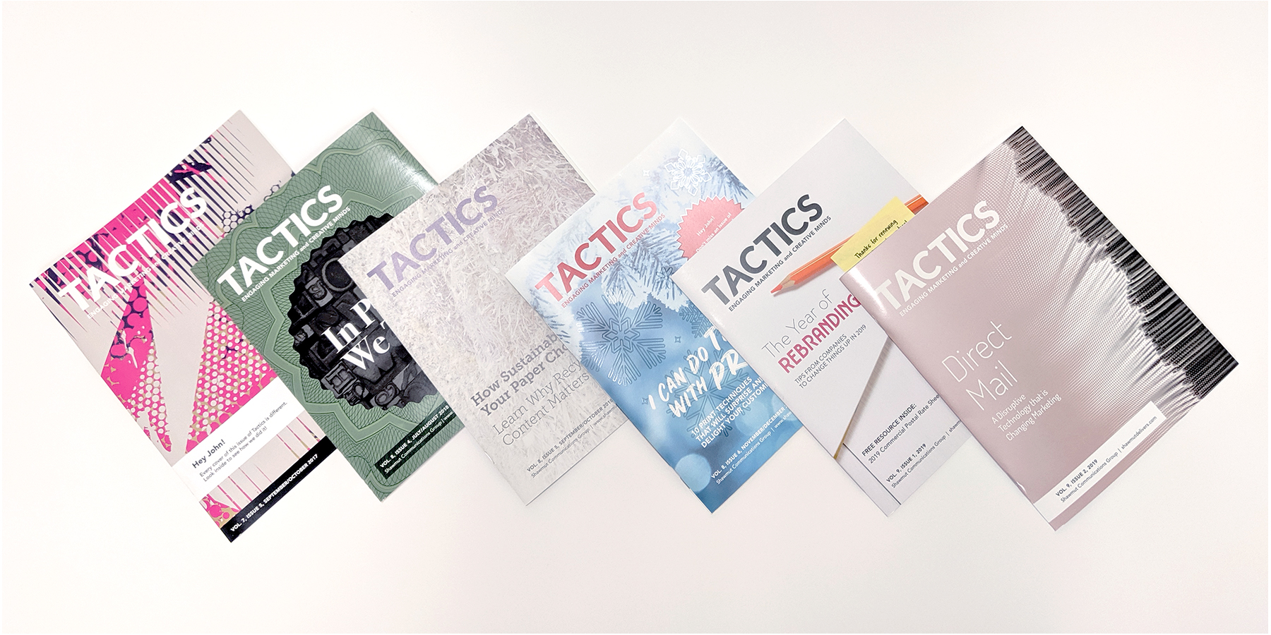
While I’d love to have every customer in for a tour, it’s not always possible. That’s one of the reasons why we produce Tactics Magazine and include a creative print production technique in every issue. It’s our way of showing (instead of telling) everyone about the latest trends and unique applications for print, paper, inks, finishes and more.
Here are six of my favorite creative print techniques that were featured in past issues of Tactics Magazine.
Dynamic Personalization
Ever wonder how Coca-Cola produced its “Share a Coke” campaign? Or how Bud Light created so many variations of their bottles featuring everything from professional sports teams to abstract colors and designs? It’s all done with dynamic personalization which we used on the cover of Tactics Magazine, Vol 7, Issue 5.
Dynamic personalization is similar to variable data printing, but it takes it to a whole new level. Rather than using a database to swap out variable text and images, dynamic personalization transforms artwork randomly. The result? Every single cover we produced for this issue of Tactics was unique.
To achieve this effect we use a digital printing software called HP Mosaic which is part of SmartStream, a technology that enables variable data printing. Using one or many vector PDF files or “seed files”, the software generates a large number of file variations by scaling, rotating, and transposing the images. This creates variable image assets which are then printed on an HP Indigo digital press.
Below you can see our vector seed file and some of the covers it produced.
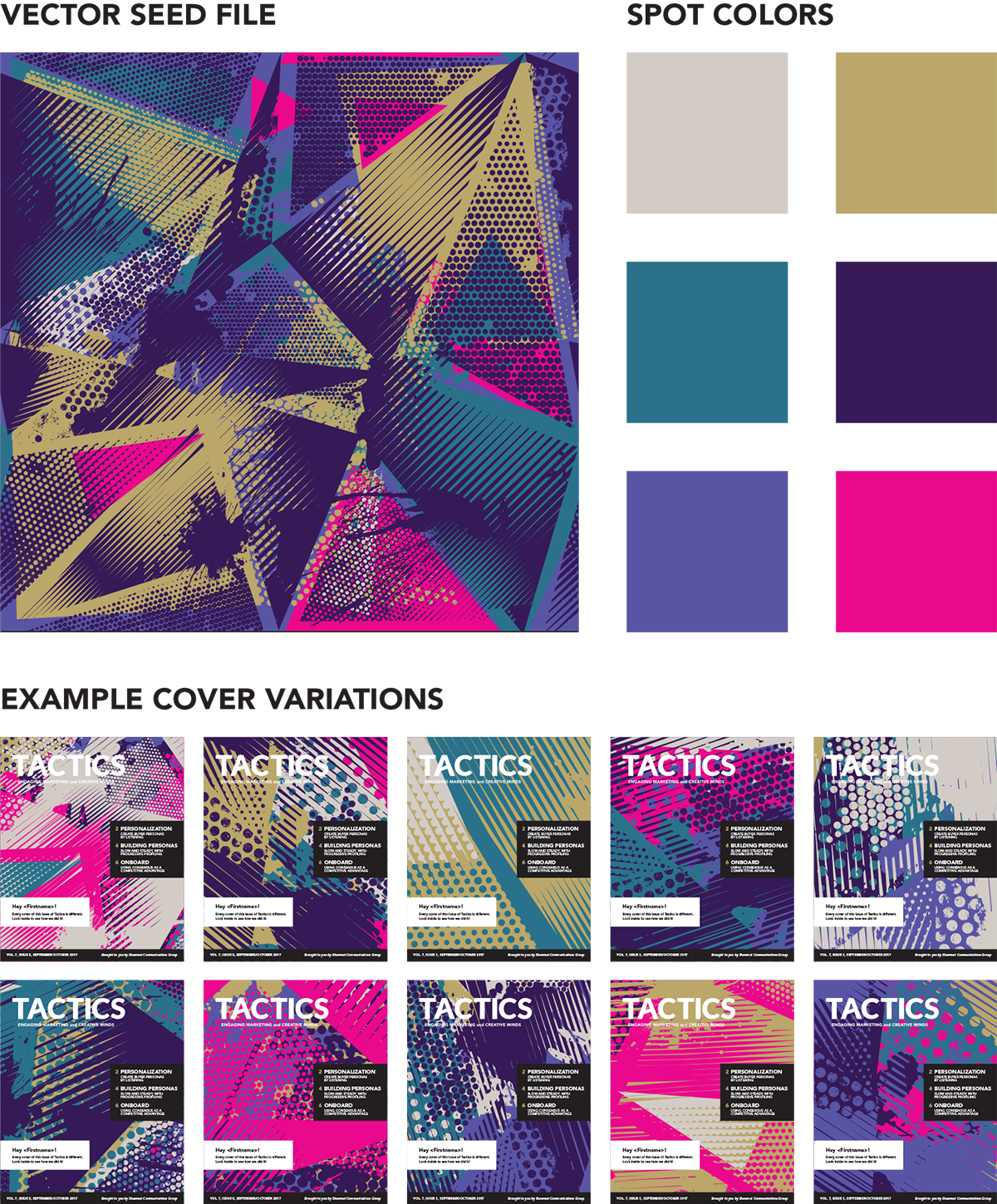
With dynamic personalization, any brand can deliver one-of-a-kind print pieces to their audience. And it’s easy to get started. All you need is vector-based artwork, a knowledgeable printer, and a little creativity.
USPS-Approved Repositionable Sticky Notes
Adding a sticky note to direct mail is a great way to point readers to the action you want them to take. But before you do, there are some rules you’ll need to follow. If not, you may be subject to additional fees or your piece could be rejected altogether.
The first rule is to ensure that your sticky note is sourced from a USPS-approved vendor and that the product has been tested and approved.
Next up: placement. For letter-size mailpieces, the repositionable sticky note (or RPN) must be attached to the address side parallel with the length and be at least ½ inch from the left and bottom edge and ⅜ of an inch away from the left side of the address. For flat-size mailpieces, the RPN may be on the address side or non-address side but it may only be placed in specific areas (see each diagram below).
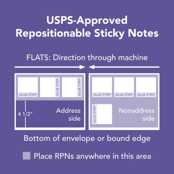
Following these two rules, particularly the use of an approved vendor will get you most of the way there. However, there are a few other rules for RPN’s including:
- Size: RPNs must be 3x3 inches, plus or minus ⅛ of an inch for either dimension
- Must not contain phosphorescent or red fluorescent inks
- Be adhered by machine and have a minimum ¾ inch adhesive strip
Raised Ink
In Vol 8, Issue 6 of Tactics Magazine, we featured snowflakes on the cover which were digitally printed with raised ink. This tactile print effect entices people to stop, take notice and of course touch the raised ink texture. It's a great way to create a memorable experience for your audience and hopefully a print piece that they’ll hang onto.
In order to produce this effect, we digitally printed our cover with HP Indigo Transparent ElectroInk. That’s it! No special die or additional machinery was required.
Unlike thermography, which requires specialty ink and powder along with multiple production processes, we achieved the same results in one pass on our digital press. The simple process is a powerful way to create high-impact direct mail, signs, packaging, business cards, and more. Plus raised ink for digital printing offers other great benefits including:
- The ability to add personalization with variable data
- No powder residue and clear, crisp print details
- Finer detail and placement of raised print areas
- The ability to add color to the transparent ink
- A wide array of paper and substrates to choose from
- A greener alternative to embossing, engraving, and thermography
By engaging someone’s sense of touch, you’ll immediately create a stronger connection and it’s more likely that customers will remember your brand and message.
Die-cut Cover and Colored Envelope
This issue of Tactics grabbed our readers attention, but surprisingly it wasn’t the creative die-cut cover that they commented on first (although it also received many compliments!). We mailed this issue in a purple booklet-style envelope with a yellow call-out that asked readers: What’s the most expensive envelope?
To find the answer, they, of course, had to open the envelope and look inside the issue. In case you didn’t get a copy, here’s what readers learned: The most expensive envelope is the one not opened.
Studies show that a stylish colored envelope is 9 times more likely to be opened than a bland white or manila one, so keep this in mind on your next mailing. The last thing you want to do is waste printing expenses and postage on envelopes that will never be opened.
PMS Metallics
People like shiny things. They catch our attention. So why not use that to your advantage in print? One of our latest issues of Tactics Magazine made use of the newly expanded collection of PMS Metallic inks. Without out a doubt, this is one of the easiest and most cost-effective ways to add some shimmer and pop to any print piece.
The rose gold color we used on the cover is one of the more popular shades. However, the collection now offers more than 650 trend-driven metallic colors to meet the needs of any design project. And since PMS inks are applied inline on our H-UV offset press it is a faster and more cost-effective way to make a print piece stand out.
Compared to foil stamping or metallic substrates, PMS Metallic inks:
- Are less expensive
- Create no waste in the recycling process
- Able to print fine screen values, as well as solid color
- Offer more than 650 color choices
Sustainable Paper
Not all recycled papers are created equal; the amount of recycled content matters. Some “recycled” stocks only contain a small percentage of recycled materials and the rest is made from virgin fiber. In other cases, artificial brighteners—which are harmful to the environment—are added to fibers to make the paper suitable for printing. That’s why it’s important to look beyond the label and really understand how your paper is made.
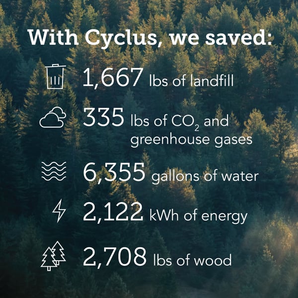
Volume 8, Issue 5 of Tactics Magazine was printed on Cyclus Print 80# coated cover, one of the best recycled papers on the market. Cyclus delivers across all three pillars of sustainability—people, profit and planet—so you can feel good about your paper choice without breaking your budget.
Thanks to the environmental calculator—developed by Arjowiggins, the makers of Cyclus—it's easy to illustrate the detailed environmental savings you can make by choosing Cyclus. Here’s how our impact was reduced by printing this issue of Tactics on Cyclus.
These six issues of Tactics Magazine each include a creative and innovative print technique—many of which our readers may not have known about. When you’re looking for creative print techniques don’t be afraid to let your imagination run wild. Chances are with the right substrate, press, technology, and knowledgeable print experts it’s possible to produce just about anything you can dream up.